Implementing design prototypes in code is a demanding, but equally rewarding process that every mobile developer must be familiar with and one of the most important phases of the creation of an app. Although tons of (albeit digital) ink has been spilled on the subject, it’s not very common to get an insight on how a developer would go on through a high-quality, professional design idea. So the purpose of this article is a small, but hopefully interesting take on this.
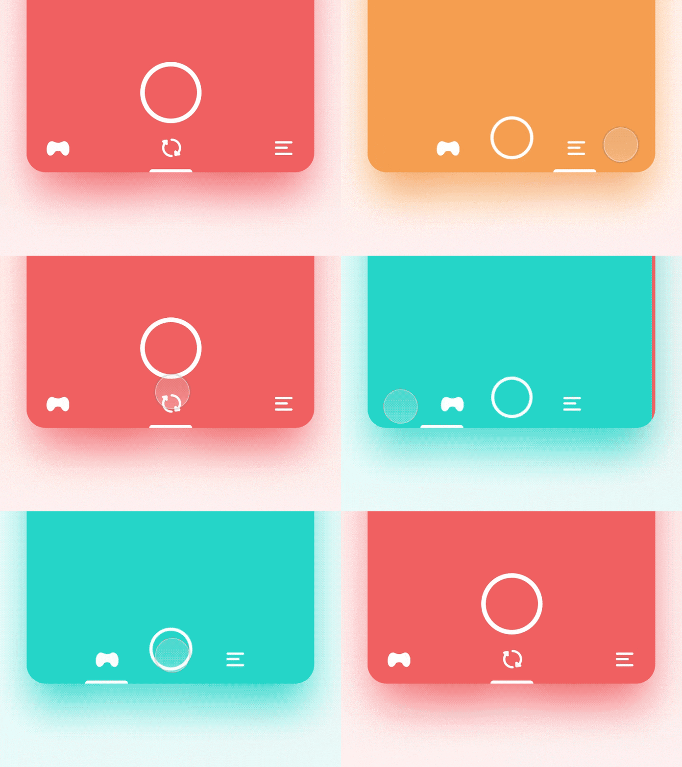
Well… without any further ado, here is what we’re going to make:

This is a prototype by Oleg Frolov , for a tabbar that could be used in AR Camera apps. It’s an elegant, clever and fluid UI that I thought it would be interesting to try implementing.
Step 1
A visual breakdown

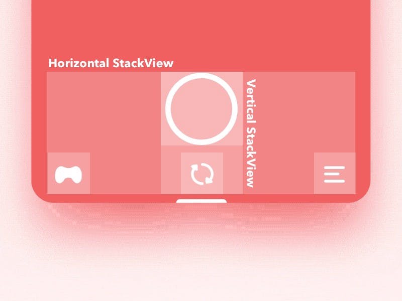
My interpretation of the layout and grouping is like this:
- A Horizontal
UIStackViewarranging the buttons in a 3 column setup - A Vertical
UIStackViewgrouping the camera and the arrows buttons, serving as my middle column - The (small) buttons have the same size
- The columns are aligned to the bottom
- There is equal spacing between the columns
- There is an indicator pinned to the bottom
Animation constraints:
- The indicator must be center-aligned (animated) to the active button
- The middle (arrows) button must be hidden when not active
- The arrows button reacts to animation with rotation
- The camera button gets smaller when the arrows are hidden
- The background reacts to animation
Step 2
UI Implementation
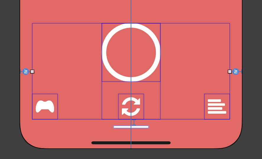
Once we have established our rules on how each element is layed out, the implementation is straight forward. The UI will be constructed in Interface Builder, but could be easily implemented in code as well.

- Leading/trailing margins are >= 20
- Indicator is w60 x h5, aligned to the bottom safe area, 10pt from the stackview
- The horizontal stackview is set on ‘Equal Spacing’ & ‘Align Bottom’
- The vertical stackview has 20pt spacing, centered horizontally in the main view
Step 3
Coding
We will use a single UIViewController (although a more sophisticated app may require separate controllers & custom transitions), but before we go ahead and create our subclass, we could implement two classes for our buttons:
@IBDesignable
class CircularButton: UIButton {

    override func awakeFromNib() {
        super.awakeFromNib()
        layer.borderColor = tintColor.cgColor
    }

    override func layoutSubviews() {
        super.layoutSubviews()
        layer.cornerRadius = bounds.midY
        layer.borderWidth  = 8 * (bounds.height / 100)
    }

    override var intrinsicContentSize: CGSize {
        return CGSize(width: 100, height: 100)
    }

    var normalHeight: CGFloat { return intrinsicContentSize.height }
    var smallHeight: CGFloat { return normalHeight * 0.6 }

    override func prepareForInterfaceBuilder() {
        super.prepareForInterfaceBuilder()
        layer.borderColor = tintColor.cgColor
    }

}
The code is pretty simple. We are making sure that our button’s layer will be always round (by setting cornerRadius to half of bound’s height — given that by convention & constraint setup the size ratio will be always 1:1). We are also “syncing” the border color to the control’s tintColor (has been set to white in the storyboard), providing a sensible intrinsicContentSize and defining a “normal” and a “small” height (for the two states of our animation)
@IBDesignable
class CustomTabButton: UIButton {

    required init?(coder aDecoder: NSCoder) {
        super.init(coder: aDecoder)
        commonInit()
    }

    override init(frame: CGRect) {
        super.init(frame: frame)
        commonInit()
    }

    override var intrinsicContentSize: CGSize {
        return CGSize(width: 44, height: 44)
    }

    func commonInit() {
        imageView?.contentMode = .scaleAspectFit
    }

}
The second subclass is for our small buttons. Super simple implementation (although the ‘tab’ in the name might not be the greatest choice, but it will be just fine for this tutorial).
I will break down the controller implementation into chunks.
First, the outlets
// The Horizontal stackView
@IBOutlet var tabStackView: UIStackView!

// The Vertical (middle) stackView
@IBOutlet var cameraButtonStackView: UIStackView!

@IBOutlet var indicatorView: UIView!

// A reference to the height constraint, so we can switch between normal/small
@IBOutlet var cameraButtonHeightConstraint: NSLayoutConstraint!

// The buttons
@IBOutlet var cameraButton: CircularButton!
@IBOutlet var gamepadButton: CustomTabButton!
@IBOutlet var linesButton: CustomTabButton!
@IBOutlet var arrowsButton: CustomTabButton!

// A reference of the X anchor of the indicator, so we can center it on active button
@IBOutlet var indicatorAnchorX: NSLayoutConstraint!
then, some trivial setup for having a light status bar, and the home indicator of the iPhoneX autohidden.
 override var preferredStatusBarStyle: UIStatusBarStyle {
     return .lightContent
 }

 override func prefersHomeIndicatorAutoHidden() -> Bool {
     return true
 }
next, there is a subtle curve on our indicator’s top corners which looks like this (the cornerRadius is just a magic number)

override func viewDidLoad() {
    super.viewDidLoad()
    // Note: This is available on iOS 11+
    indicatorView.layer.maskedCorners = [.layerMinXMinYCorner, .layerMaxXMinYCorner]
    indicatorView.layer.cornerRadius = 4
}
a few methods for our animation states
func hideArrows() {
    arrowsButton.isHidden = true
    cameraButtonHeightConstraint.constant = cameraButton.smallHeight
}

func showArrows() {
    arrowsButton.isHidden = false
    cameraButtonHeightConstraint.constant = cameraButton.normalHeight
}

func rotateArrows(reset: Bool = false) {
    arrowsButton.transform = reset ? .identity :  CATransform3DGetAffineTransform(CATransform3DMakeRotation(.pi, 0, 0, 1))
}

func centerIndicatorTo(_ view: UIView) {
    indicatorAnchorX.isActive = false
    indicatorAnchorX = indicatorView.centerXAnchor.constraint(equalTo: view.centerXAnchor)
    indicatorAnchorX.isActive = true
}
The first two methods are pretty straight forward, they show/hide the arrows button and switching our camera button’s height between normal/small.
The rotateArrows method, applies a 180° rotation in the Z axis and resets the transform via a flag.
The centerIndicatorTo method is simply reassigning a new anchor to the indicator in order to be centered on any given view.
Finally we have an action that is hooked up to fire from the two small buttons (excluding the arrows) and the camera button, that triggers the animation
func animate(block: @escaping () -> Void) {
    UIView.animate(withDuration: 0.75,
                   delay: 0.0,
                   usingSpringWithDamping: 0.4,
                   initialSpringVelocity: 0.0,
                   options: [.allowUserInteraction],
                   animations: block)
}

@IBAction func didSelectTab(_ sender: UIButton) {
    let colors = [#colorLiteral(red: 0.1405054927, green: 0.8361622691, blue: 0.7859327197, alpha: 1), #colorLiteral(red: 0.9409117103, green: 0.3756327331, blue: 0.3815465271, alpha: 1), #colorLiteral(red: 0.9581180215, green: 0.6209359765, blue: 0.3150889277, alpha: 1)]
    sender == cameraButton ? showArrows() : hideArrows()
    centerIndicatorTo(sender)
    animate { [unowned self] in
        self.rotateArrows(reset: sender == self.cameraButton)
        // Note: I have tagged the buttons in Interface Builder [0-Left, 1-Middle, 2-Right]
        self.view.backgroundColor = colors[sender.tag]
        self.view.layoutIfNeeded()
    }
}
The animate function is a spring animation with some values that felt close to the design, including an .allowsUserInteraction option so we can fire the animation even mid-flight.
Here is what the didSelectTab action does:
- Define some colors (these will serve as backgrounds for our main view — one for each button selection)
- If the sender is the camera button show the arrows else hide them
- Center the indicator to the sender
- Submit an animation block that:
- Rotates the arrows
- Changes the background color
- Triggers a layout update
and that’s it… we have broken down all this ‘complex’, choreographed sequence to a simple interpolation between states!
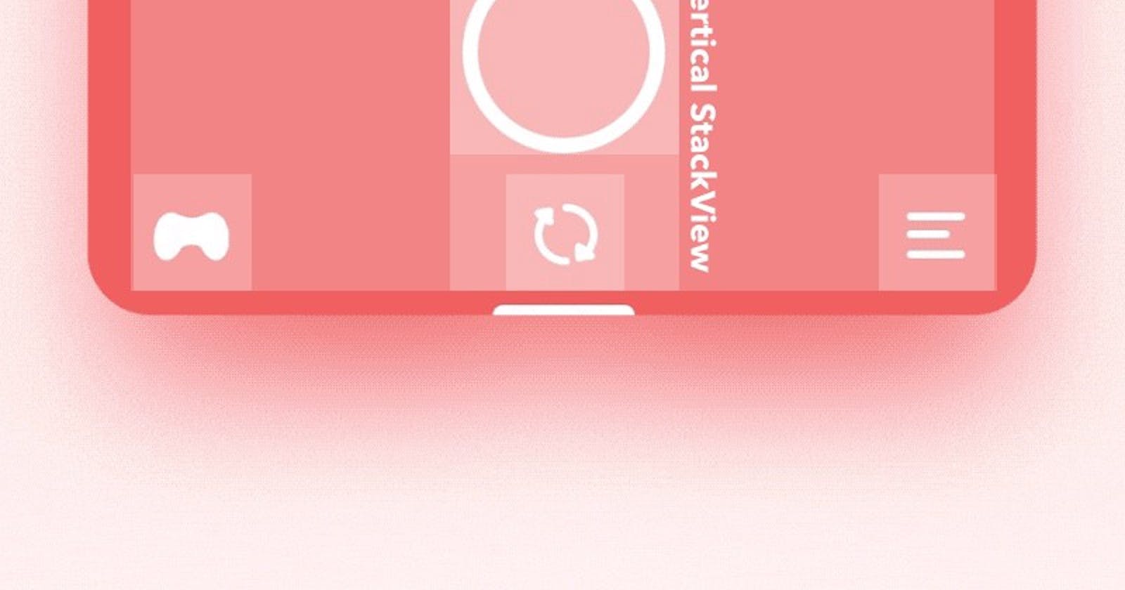
Below is what we managed to do. Not bad at all :)
I hope you enjoyed it as much as I did while putting it together.
